
![]()

Biopharma giant GlaxoSmithKline (recently rebranded as GSK) has officially “demerged” its consumer healthcare business from GSK Group under the name Haleon. The creation of Haleon resulted from strategic changes to GSK’s consumer health business, including integrations of product portfolios from Pfizer. GSK Group will retain biopharmaceuticals and vaccines and continue its significant investment in R&D.
 Haleon takes with it well-known brands such as Sensodyne, Centrum, Theraflu, and leading US analgesic brand Advil, instantly creating the world’s biggest standalone consumer health business. When the new company’s shares hit the London Stock Exchange Monday, it was the largest listing in the past decade.
Clearly, Haleon has come out of the gate a strong company, but what about its name?
Looking good
Haleon is easy to say and spell for an international audience. It’s clearly a coined term, but it still looks and feels natural. It’s relatively short, which means it’s well-suited for signage, stock tickers, even arena name sponsorships.
Haleon comes across as established and strong (perfect for a blue chip corporate brand) while clearly standing apart from GSK and Pfizer (perfect for distinguishing the new company from its origins). In fact, the name is completely unlike most of the other big names in consumer health products, which are mostly family names (Procter & Gamble, Johnson & Johnson, Bayer). It’s less of a standout from the other three big consumer health players in terms of name construction—Novartis (from nova artes, “new art” in Latin), Amway (short for American Way), and Sanofi (probably derived from sanus, “healthy” in Latin or santé, “health” in French)—but still holds its own in this group given its unique sound and meaning.
Finally, the company managed to acquire the exact .com domain, which is no easy feat these days.
On brand
According to the company’s release, “Haleon (pronounced ‘Hay-Lee-On’) is inspired by the merging of the words ‘Hale’, which is an old English word that means ‘in good health’ and Leon, which is associated with the word ‘strength’.”
Hale is indeed an English word meaning “healthy” or “robust” (though we’d say “a dated word” rather than “old English word” to be clear that this word is modern English) and is still in use today, at least poetically and in phrases like hale and hearty. You might be familiar with hale poetically, or in the phrase hale and hearty. Hale shares Old English roots with other modern words such as whole and health.
Leon traces its roots from the Ancient Greek and Latin terms for lion—certainly a strong and regal animal, at least symbolically. We contend that most people encountering Haleon won’t pick up on that connection, though, particularly since the personal name Leon has none of the associations for the average person.
Rather, audiences will instinctively understand the name as hale + -on, which works just fine. This reading groups Haleon with similarly constructed scientific terms such as proton, silicon, and photon, suggesting scientific precision and reliability, an apt association for a healthcare brand. To get into the linguistic weeds a bit, the -on suffix is used to form names in physics (particles and substances), biology (fundamental units), and chemistry (elements). It subtly signals that this brand is foundational and strongly stands on its own.
In the end, Haleon is strategically sound: through tone and meaning it effectively expresses health and strength, even if not quite in the way the company explained.
And on message?
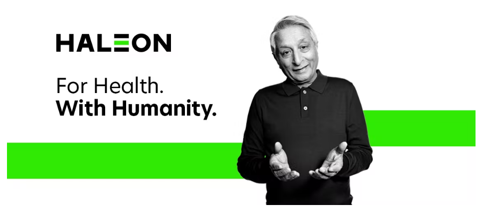
The slogan for the new company appears to be “For Health. With humanity.” Given Haleon’s sciencey tone, we aren’t seeing the humanity. (Generally speaking, sciencey/techy names lean cold, hard rather than warm, soft, and the latter qualities are most associated with humanness and nurturing.) Even the logo comes across as hard, with its all caps in an angular font.
 But because consumers will not have much direct contact with this name, the target audiences are investors and other businesses. These groups are traditionally more interested in strength for a company than humanity. In all likelihood, the humanity message was not considered priority in name development, and will be supported by other brand expression such as the image here. (Remember, names don’t exist in a vacuum and can’t express every relevant idea.) So this absence isn’t really a flaw.
Speaking of flaws that may not really be flaws, Haleon doesn’t suggest a concrete image for audiences to latch onto, mentally or visually. This lack can hinder memorability and certainly impacts graphic potential. But again, since the name isn’t meant for consumers, picturability is not an important feature.
Overall, we are fans of Haleon. The name is highly strategic and fairly creative in its use of a poetic word. Well done!


